" height="17px" id="lfjk5AodK" width="20px"/></svg>)
graphic
design
graphic
design
graphic
design
Explore the graphic design portfolio of Cory Creature, featuring a curated selection of creative projects that showcase innovative branding, digital layouts, and print campaigns.
Zen with Lizanne
Zen with Lizanne
Zen with Lizanne……………………………
Annihilation
Annihilation
Annihilation…………………………………………
Cave Art
Cave Art
Cave Art………………………………………………
Something Wicked This Way Comes
Something Wicked This Way Comes
Something Wicked This Way Comes
Brand Identity
Brand Identity
Brand Identity
Book Design
Book Design
Book Design
Brand Identity
Brand Identity
Brand Identity
Book Design
Book Design
Book Design




Signage designed using a photograph of a local forest overlayed on brand colour background with Logo and tagline as the main focus. Designed for interior use, printed and plaque mounted for a tight space. UV film and hand painted edge applied.

Business card design that expresses the brand identity and features a promotional offer on backside

Web Page Preview
Brand Identity:
Zen with Lizanne
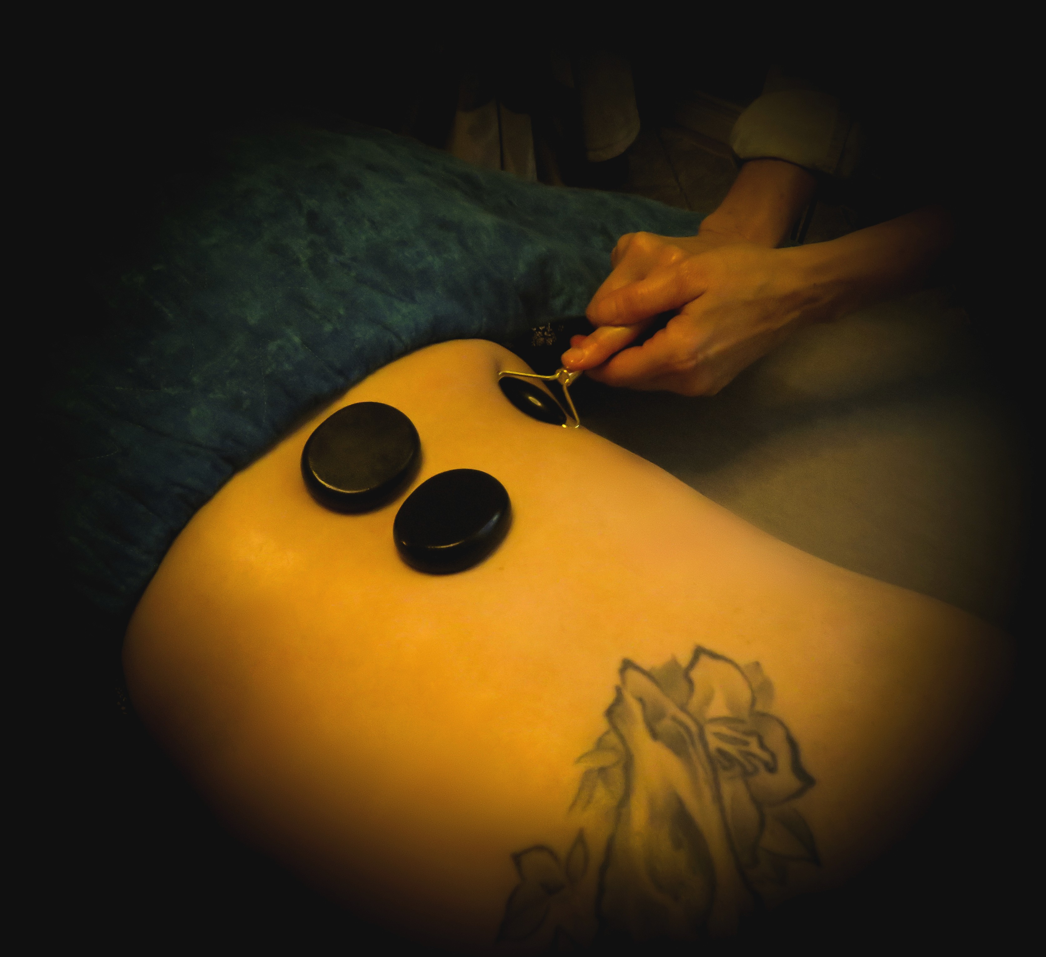
Developed a cohesive brand identity for a wellness practitioner, which included:
Logo Design
Web Design
Business Cards
Gift Certificates
Signage
Logo Design
Web Design
Business Cards
Gift Certificates
Signage




© 2026
All Rights Reserved
Signage designed using a photograph of a local forest overlayed on brand colour background with Logo and tagline as the main focus. Designed for interior use, printed and plaque mounted for a tight space. UV film and hand painted edge applied.
Business card design that expresses the brand identity and features a promotional offer on backside
Web Page Preview
Brand Identity:
Zen with Lizanne
Developed a cohesive brand identity for a wellness practitioner, which included:
Logo Design
Web Design
Business Cards
Gift Certificates
Signage
© 2026
All Rights Reserved

Brand Identity:
Cave Art
Prompt: create an identity reminiscent of a retro poster shop with a primitive cave lizard drawing as reference for the mascot.
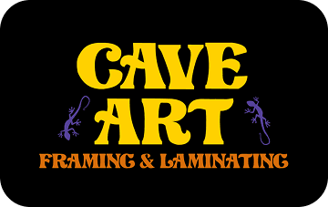

web banner created for online marketing
web banner created for online marketing


Identifying label for back of finished picture frames to signify who the work was done by.
© 2026
All Rights Reserved
Brand Identity:
Cave Art
Prompt: create an identity reminiscent of a retro poster shop with a primitive cave lizard drawing as reference for the mascot.
web banner created for online marketing
Identifying label for back of finished picture frames to signify who the work was done by.
© 2026
All Rights Reserved
Annihilation by Jeff VanderMeer
Annihilation by Jeff VanderMeer
Redesign of the ecological horror novel “Annihilation” by Jeff VanderMeer
Redesign of the ecological horror novel
“Annihilation” by Jeff VanderMeer

Stacked text used to represent “the Tower” that is a main focus of the novel.
Overlay of repeating mantra scrolled in the background of cover to set the tone of the book.

Motif of fungal growth used to convey the main themes of decay and rebirth that are represented within the story.
The organic shapes and heavy weight of Berthold W1G Extra Condensed convey the biological nature of the story while still portraying the tension and horror aspect with the font’s condensed aspect ratio.
Forum was chosen to counterbalance the Berthold W1G while representing the formal quality of a field report.
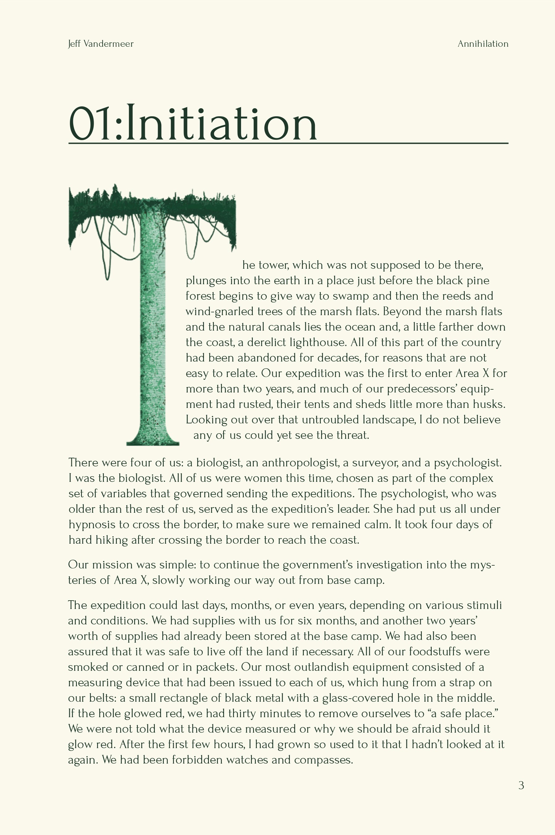
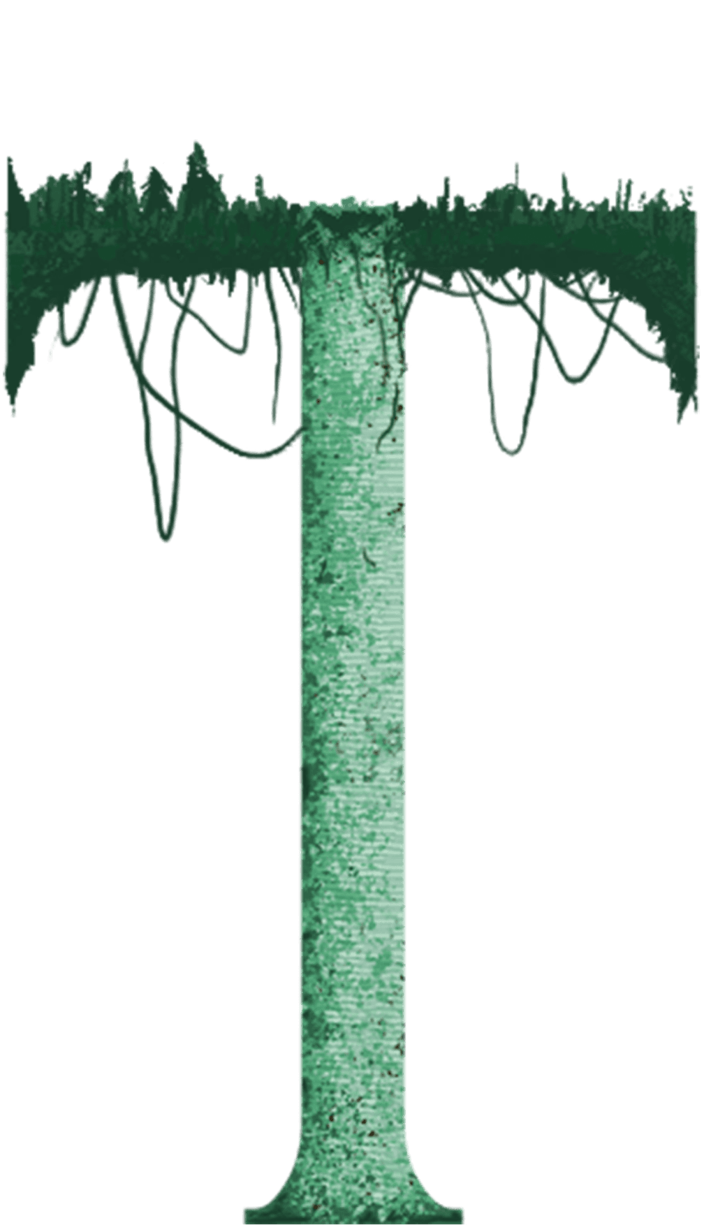
The first page of the book with a Drop Cap that represents the Tower. The “tower” is a massive part of this book. It is a large circular structure in the ground that appears to be made from coquina and stone.
This tower isn’t supposed to be there according to previous expedition reports, creating the first real tension in the story.
The first page of the book with a Drop Cap that represents the Tower. The “tower” is a massive part of this book. It is a large circular structure in the ground that appears to be made from coquina and stone.
This tower isn’t supposed to be there according to previous expedition reports, creating the first real tension in the story.

The first page of the book with a Drop Cap that represents the Tower. The “tower” is a massive part of this book. It is a large circular structure in the ground that appears to be made from coquina and stone.
This tower isn’t supposed to be there according to previous expedition reports, creating the first real tension in the story.

Something Wicked This Way Comes by Ray Bradbury
Something Wicked This Way Comes by Ray Bradbury
Redesign of the classic carnival horror novel “Something Wicked This Way Comes” by Ray Bradbury
Redesign of the classic carnival horror novel
“Something Wicked This Way Comes” by Ray Bradbury

Espiritu Condensed is used for the book title to create tension, warped to suggest the spinning disorientation of a carousel.
The ornate flourishes in CoFo Raffine bring a whimsical brittleness to this horror story.
Espiritu Condensed is used for the book title to create tension, warped to suggest the spinning disorientation of a carousel.
The ornate flourishes in CoFo Raffine bring a whimsical brittleness to this horror story.
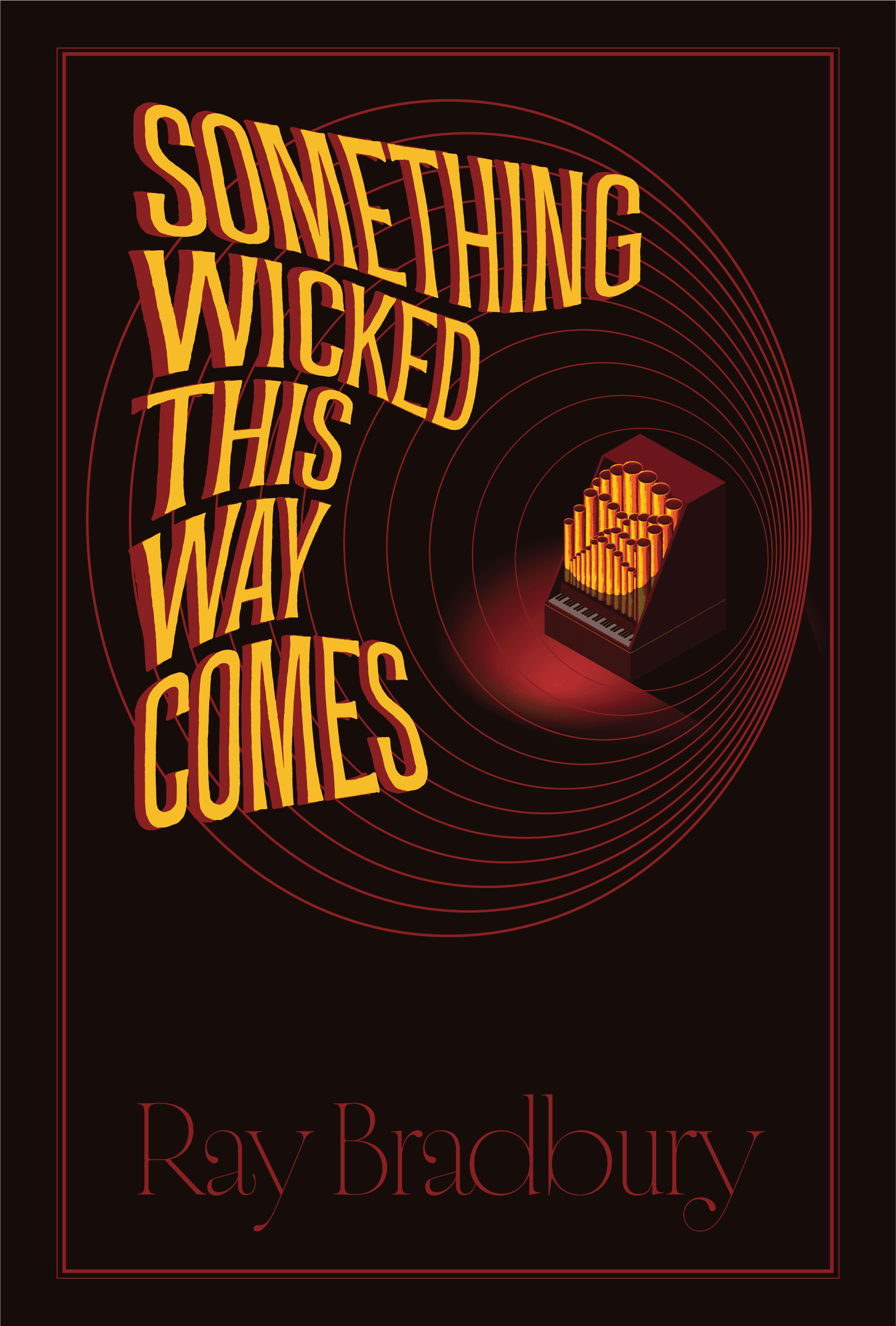
Calliope acts as an anchor point, surrounded by vibrating lines that represent its music projecting the title.
Something Wicked This Way Comes brings a carnival of terror from the author of Fahrenheit 451.
Calliope acts as an anchor point, surrounded by vibrating lines that represent its music projecting the title.
Something Wicked This Way Comes brings a carnival of terror from the author of Fahrenheit 451.

The first page uses a Drop Cap to represent the lightning rod—a protective force that becomes far more than it first appears.
Espiritu Condensed continues into chapter titles, while delicate body typography gives the classic story its haunting, spidery quality.
The first page uses a Drop Cap to represent the lightning rod—a protective force that becomes far more than it first appears.
Espiritu Condensed continues into chapter titles, while delicate body typography gives the classic story its haunting, spidery quality.

